data <- read.csv("ML_wind_data.csv")

library(ggplot2)Data Visualization
Our aggregate statistic represents a combination of indirect and direct injuries and death, damage to property, and damage to crops caused by the wind event.
Description
This page allows you to explore visualizations of our data to aid in your understanding our dataset and the wind devastation statistic. We include visualizations of our predictor variables, the variables included in the wind devastation statistic, and the wind devastation statistic itself. We also began exploring the relationship between the wind devastation characteristic and a few of our predictor variables.
Import Data
Wind Devastation Categorization
Note
Description of Wind Devastation Categorization
0 - No Devastation
1 - Minimal Devastation
2 - Low Devastation
3 - Moderate Devastation
4 - Most Devastation
ggplot(data, aes(x = scaled_aggregate)) +
  geom_histogram(fill = "darkmagenta", color = "black") +
  labs(x = "Wind Devastation Categorization", y = "Count", fill = "Year", title = "Histogram of the Wind Devastation\nCategorization", caption = "Data from NOAA storm events database from 2008, 2013, and 2018", subtitle = "The majority of events had no devastation followed by\nminimal devastation.") +
  theme_minimal() +
  theme(plot.title = element_text(size = 21, face = "bold"),
    plot.subtitle = element_text(size = 17),
    axis.title.x = element_text(size = 19),
    axis.title.y = element_text(size = 19),
    axis.text.x = element_text(size = 17),
    axis.text.y = element_text(size = 17))
`stat_bin()` using `bins = 30`. Pick better value with `binwidth`.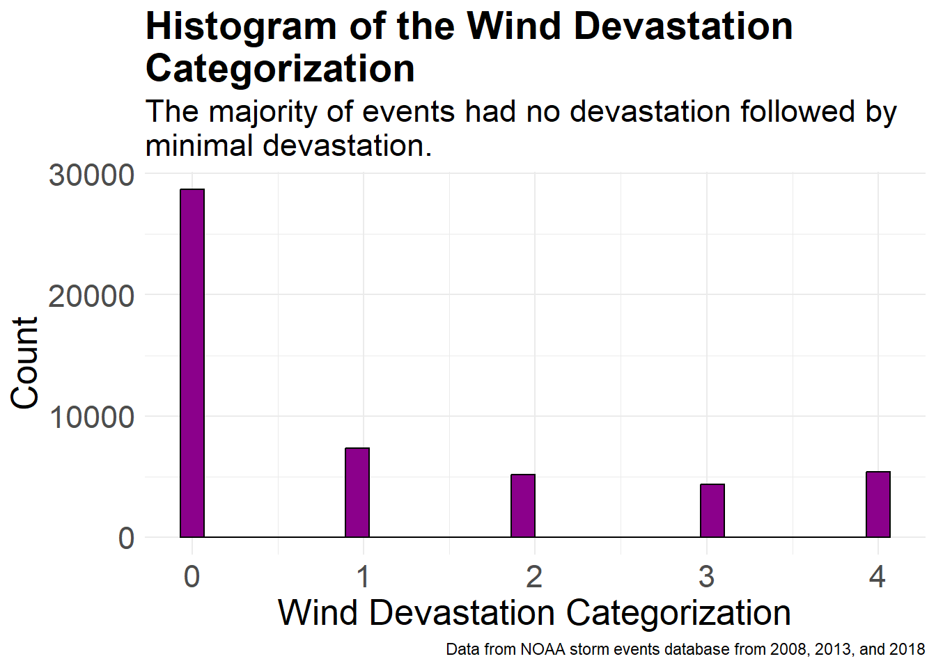
ggplot(data, aes(x = scaled_aggregate, fill = factor(YEAR))) +
  geom_histogram(binwidth = (max(data$scaled_aggregate, na.rm = TRUE) - min(data$scaled_aggregate, na.rm = TRUE)) / 15,
                 alpha = 0.6, position = "dodge", boundary = 0, color = "black") +
  scale_fill_manual(values = c("2018" = "blue", "2008" = "red", "2013" = "green")) +    labs(x = "Wind Devastation Categorization", y = "Count", fill = "Year", title = "Histogram of the Devastation Categorization\ngrouped by year", caption = "Data from NOAA storm events database from 2008, 2013, and 2018", subtitle  = "Distribution by years are pretty similar but 2008 has the\nmost devastation.") +
  theme_minimal() +
  theme(plot.title = element_text(size = 21, face = "bold"),
    plot.subtitle = element_text(size = 17),
    axis.title.x = element_text(size = 19),
    axis.title.y = element_text(size = 19),
    axis.text.x = element_text(size = 14),
    axis.text.y = element_text(size = 17),
    legend.text = element_text(size = 15),
legend.title = element_text(size = 18)) 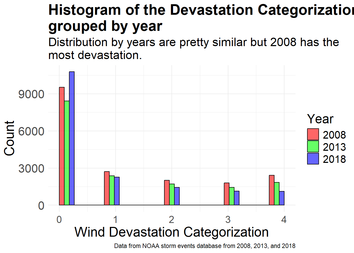
ggplot(data, aes(x = scaled_aggregate, fill = factor(MONTH_NAME))) +
  geom_histogram(binwidth = (max(data$scaled_aggregate, na.rm = TRUE) - min(data$scaled_aggregate, na.rm = TRUE)) / 15,
                 alpha = 0.6, position = "dodge", boundary = 0)   + labs(x = "Wind Devastation Categorization", y = "Count", fill = "Month", title = "Histogram of the Devastation Categorization\ngrouped by month", caption = "Data from NOAA storm events database from 2008, 2013, and 2018", subtitle = "Events during summer months appear to cause the most\ndevastation.") +
  theme_minimal() +
  theme(plot.title = element_text(size = 21, face = "bold"),
    plot.subtitle = element_text(size = 17),
    axis.title.x = element_text(size = 15),
    axis.title.y = element_text(size = 15),
    axis.text.x = element_text(size = 14),
    axis.text.y = element_text(size = 15),
    legend.text = element_text(size = 10),
legend.title = element_text(size = 15)) 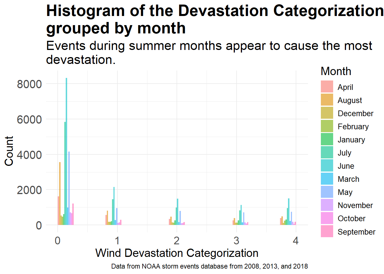
ggplot(data, aes(x = scaled_aggregate, fill = EVENT_TYPE)) +
  geom_histogram(binwidth = (max(data$scaled_aggregate, na.rm = TRUE) - min(data$scaled_aggregate, na.rm = TRUE)) / 15,
                 alpha = 0.6, position = "dodge", boundary = 0, color = "black")   + labs(x = "Wind Devastation Categorization", y = "Count", fill = "Event Type", title = "Histogram of the Devastation Categorization\ngrouped by event type", caption = "Data from NOAA storm events database from 2008, 2013, and 2018", subtitle = "Majority of the data is from thunderstorm wind events.") +
  theme_minimal() +
  theme(plot.title = element_text(size = 19, face = "bold"),
    plot.subtitle = element_text(size = 15),
    axis.title.x = element_text(size = 17),
    axis.title.y = element_text(size = 17),
    axis.text.x = element_text(size = 12),
    axis.text.y = element_text(size = 15),
    legend.text = element_text(size = 10),
legend.title = element_text(size = 13)) 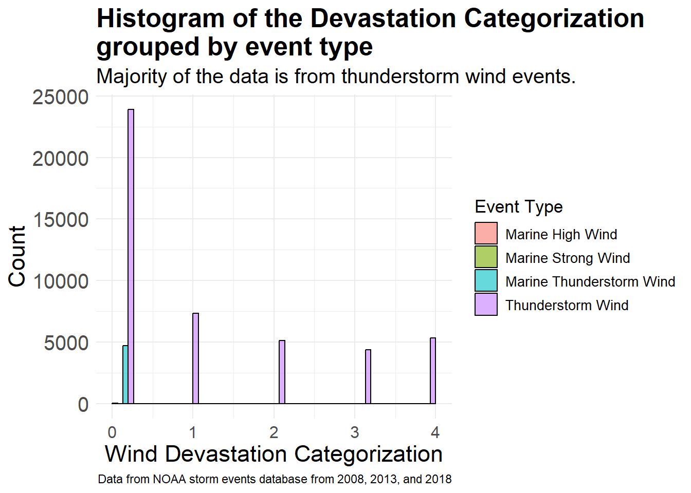
Predictor Variables
ggplot(data, aes(x = STATE)) +
  geom_bar(fill = "deepskyblue1", color = "black") +
  labs(title = "Number of Extreme Wind Events by State", caption = "Data from NOAA storm events database from 2008, 2013, and 2018",
  subtitle = "There is state-to-state variability of extreme wind event\noccurrences.",
    x = "U.S. State",
    y = "Number of Extreme Wind Events") +
  theme_minimal() +
  theme(plot.title = element_text(size = 21, face = "bold"),
    plot.subtitle = element_text(size = 17),
    axis.title.x = element_text(size = 19),
    axis.title.y = element_text(size = 19),
    axis.text.x = element_text(size = 6.5,
      face = "bold", angle = 55, hjust = 1),
    axis.text.y = element_text(size = 17))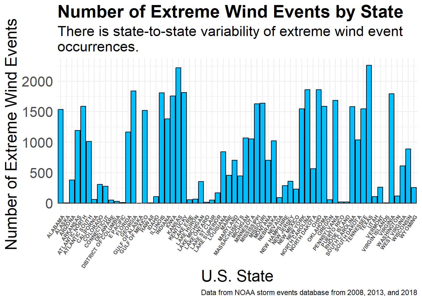
data$MONTH_NAME <- factor(data$MONTH_NAME,
                          levels = c("January", "February",
                                     "March", "April", "May",
                                     "June", "July", "August", "September", "October",
                                     "November", "December"))

ggplot(data, aes(x = MONTH_NAME)) +
  geom_bar(fill = "deepskyblue2", color = "black") +
  labs(title = "Number of Extreme Wind Events by Month", caption = "Data from NOAA storm events database from 2008, 2013, and 2018",
  subtitle = "Summer months have higher occurrences of extreme\nwind events.",
    x = "Month",
    y = "Count") +
  theme_minimal() +
  theme(plot.title = element_text(size = 21, face = "bold"),
    plot.subtitle = element_text(size = 17),
    axis.title.x = element_text(size = 19),
    axis.title.y = element_text(size = 19),
    axis.text.x = element_text(size = 17, angle = 45, hjust = 1),
    axis.text.y = element_text(size = 17))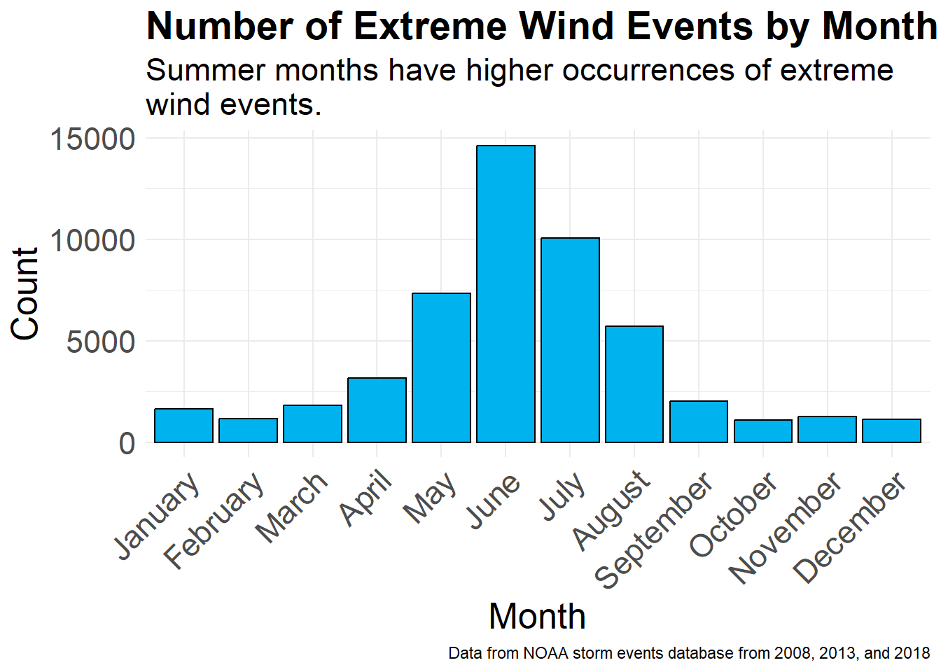
ggplot(data, aes(x = MAGNITUDE)) +
  geom_histogram(binwidth = 10, fill = "deepskyblue3", color = "black") +
  labs(title = "Histogram of Extreme Wind Events by\nWind Speed", caption = "Data from NOAA storm events database from 2008, 2013, and 2018",
    subtitle = "A wind speed of 50 knots is the most common in\nextreme wind events.",
    x = "Magnitude - Wind Speed (knots)",
    y = "Frequency") +
  theme_minimal() +
  theme(plot.title = element_text(size = 21, face = "bold"),
    plot.subtitle = element_text(size = 17),
    axis.title.x = element_text(size = 19),
    axis.title.y = element_text(size = 19),
    axis.text.x = element_text(size = 17),
    axis.text.y = element_text(size = 17))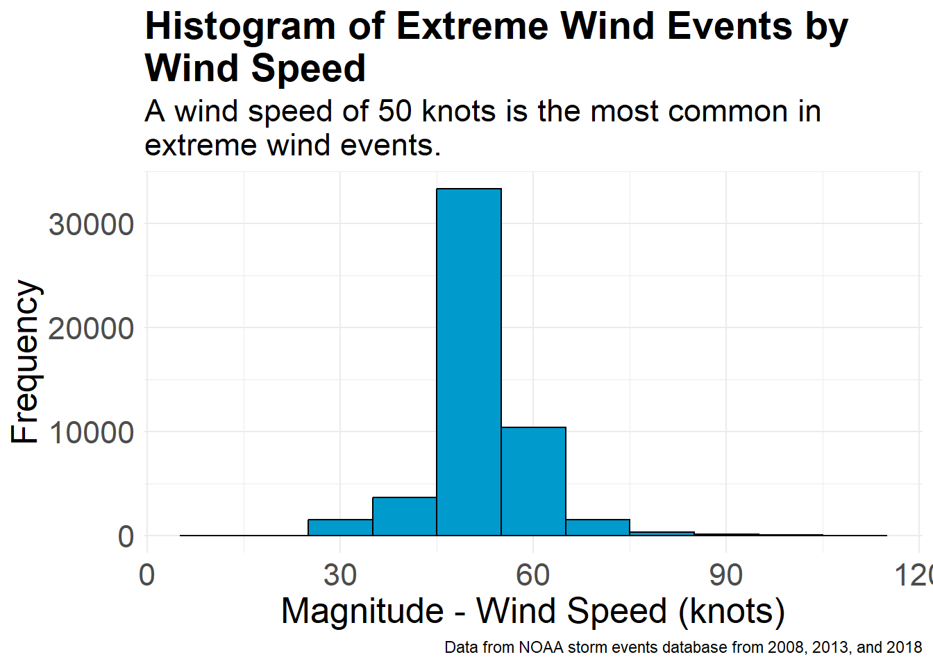
data$YEAR <- as.factor(data$YEAR)

ggplot(data, aes(x = YEAR)) +
  geom_bar(fill = "deepskyblue4", color = "black") +
  labs(title = "Number of Extreme Wind Events by Year", caption = "Data from NOAA storm events database",
    subtitle = "2008 has a slightly higher occurrence of extreme wind\nevents.",
    x = "Year",
    y = "Count") +
  theme_minimal() +
  theme(plot.title = element_text(size = 21, face = "bold"),
    plot.subtitle = element_text(size = 17),
    axis.title.x = element_text(size = 19),
    axis.title.y = element_text(size = 19),
    axis.text.x = element_text(size = 17),
    axis.text.y = element_text(size = 17))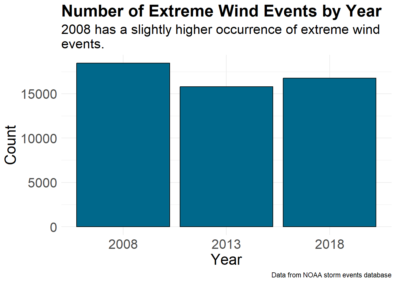
Variables in Wind Devastation Categorization: Zero Counts and Non-Zero Frequencies
Some of the variables in the wind devastation categorization have high counts of value zero. Thus, to better visualize our data, we visualized the counts of zero and non-zero data, and then plotted distributions of the non-zero values.
#make category
data$DAMAGE_CROPS_cat <- ifelse(data$DAMAGE_CROPS == 0, "Zero", "Non-Zero")

ggplot(data, aes(x = DAMAGE_CROPS_cat)) +
  geom_bar(fill = "coral1", color = "black") +
  labs(title = "Counts of Non-Zero vs. Zero Crop Damage", caption = "Data from NOAA storm events database from 2008, 2013, and 2018",
  subtitle = "Most extreme weather events have zero crop damage.",
    y = "Count") +
  theme_minimal() +
  theme(plot.title = element_text(size = 21, face = "bold"),
    plot.subtitle = element_text(size = 17),
    axis.title.x = element_blank(),
    axis.title.y = element_text(size = 19),
    axis.text.x = element_text(size = 17),
    axis.text.y = element_text(size = 17))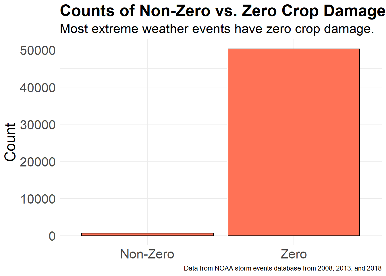
#remove zeros
non_zero_DAMAGE_CROPS <- data[data$DAMAGE_CROPS > 0, ]

ggplot(non_zero_DAMAGE_CROPS, aes(x = DAMAGE_CROPS)) +
  geom_histogram(binwidth = 10, fill = "coral3", color = "black") +
  labs(title = "Histogram of Non-Zero Crop Damage From\nExtreme Wind", caption = "Data from NOAA storm events database from 2008, 2013, and 2018",
  subtitle = "Generally, there are low crop damage costs due to\nextreme weather events.",
    x = "Crop Damage (in thousands of dollars)",
    y = "Frequency") +
  theme_minimal() +
  theme(plot.title = element_text(size = 21, face = "bold"),
    plot.subtitle = element_text(size = 17),
    axis.title.x = element_text(size = 20),
    axis.title.y = element_text(size = 19),
    axis.text.x = element_text(size = 17),
    axis.text.y = element_text(size = 17))
#make category
data$DAMAGE_PROPERTY_cat <- ifelse(data$DAMAGE_PROPERTY == 0, "Zero", "Non-Zero")

ggplot(data, aes(x = DAMAGE_PROPERTY_cat)) +
  geom_bar(fill = "darkorchid1", color = "black") +
  labs(title = "Counts of Non-Zero vs. Zero Property\nDamage", caption = "Data from NOAA storm events database from 2008, 2013, and 2018",
  subtitle = "More extreme weather events have zero property\ndamage than non-zero.",
    y = "Count") +
  theme_minimal() +
  theme(plot.title = element_text(size = 21, face = "bold"),
    plot.subtitle = element_text(size = 17),
    axis.title.x = element_blank(),
    axis.title.y = element_text(size = 19),
    axis.text.x = element_text(size = 17),
    axis.text.y = element_text(size = 17))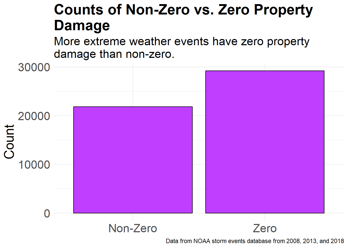
#remove zeros
non_zero_DAMAGE_PROPERTY <- data[data$DAMAGE_PROPERTY > 0, ]

ggplot(non_zero_DAMAGE_PROPERTY, aes(x = DAMAGE_PROPERTY)) +
  geom_histogram(fill = "darkorchid3", color = "black") +
  labs(title = "Histogram of Non-Zero Property Damage\nFrom Extreme Wind", caption = "Data from NOAA storm events database from 2008, 2013, and 2018",
  subtitle = "Generally, there are low property damage costs due to\nextreme weather events.",
    x = "Property Damage (in thousands of dollars)",
    y = "Frequency") +
  scale_x_log10() +
  theme_minimal() +
  theme(plot.title = element_text(size = 21, face = "bold"),
    plot.subtitle = element_text(size = 17),
    axis.title.x = element_text(size = 20),
    axis.title.y = element_text(size = 19),
    axis.text.x = element_text(size = 17),
    axis.text.y = element_text(size = 17))
`stat_bin()` using `bins = 30`. Pick better value with `binwidth`.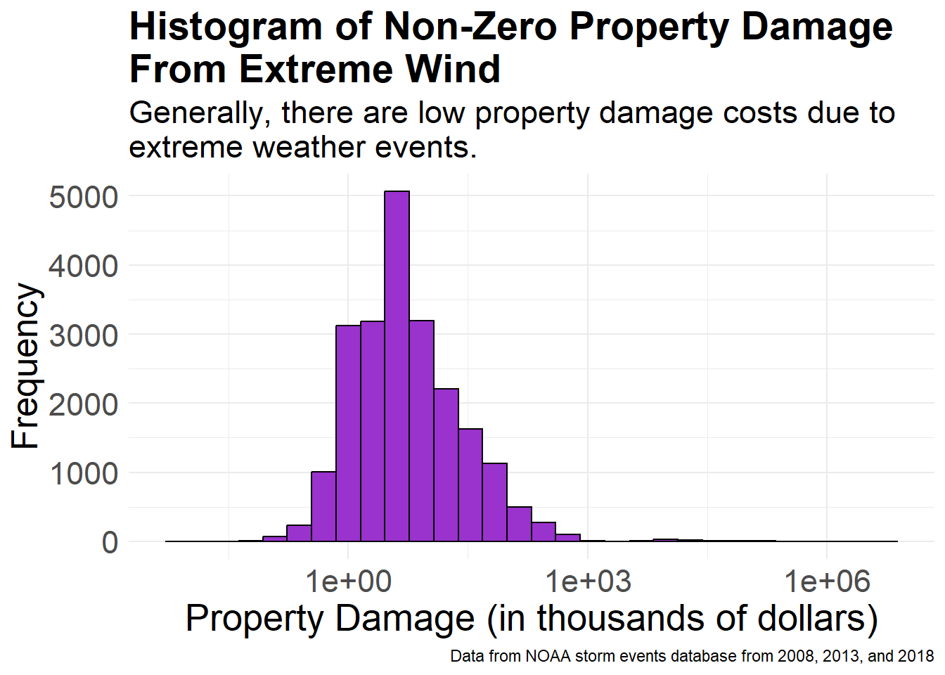
#make category
data$INJURIES_INDIRECT_cat <- ifelse(data$INJURIES_INDIRECT == 0, "Zero", "Non-Zero")

ggplot(data, aes(x = INJURIES_INDIRECT_cat)) +
  geom_bar(fill = "darkseagreen1", color = "black") +
  labs(title = "Counts of Non-Zero vs. Zero Indirect\nInjuries", caption = "Data from NOAA storm events database from 2008, 2013, and 2018",
  subtitle = "Most extreme weather events have zero indirect injuries.",
    y = "Count") +
  theme_minimal() +
  theme(plot.title = element_text(size = 21, face = "bold"),
    plot.subtitle = element_text(size = 17),
    axis.title.x = element_blank(),
    axis.title.y = element_text(size = 19),
    axis.text.x = element_text(size = 17),
    axis.text.y = element_text(size = 17))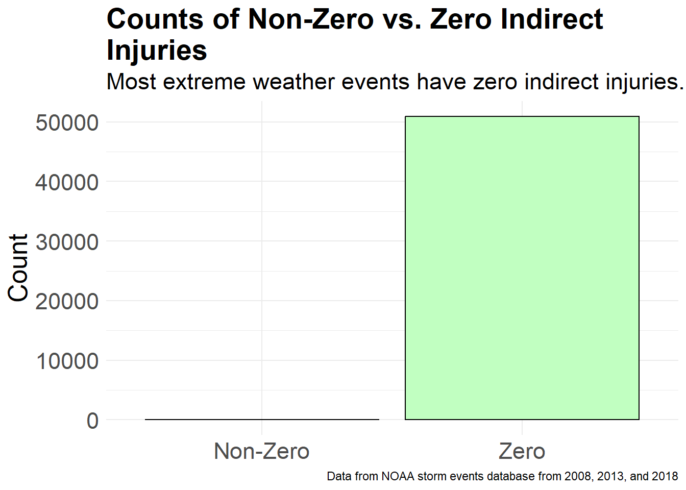
#remove zeros
non_zero_INJURIES_INDIRECT <- data[data$INJURIES_INDIRECT > 0, ]

ggplot(non_zero_INJURIES_INDIRECT, aes(x = INJURIES_INDIRECT)) +
  geom_histogram(binwidth = 1, fill = "darkseagreen3", color = "black") +
  labs(title = "Histogram of Non-Zero Indirect Injuries From\nExtreme Wind", caption = "Data from NOAA storm events database from 2008, 2013, and 2018",
  subtitle = "Generally, there are low indirect injuries due to extreme\nweather events.",
    x = "Indirect Injuries",
    y = "Frequency") +
  theme_minimal() +
  theme(plot.title = element_text(size = 21, face = "bold"),
    plot.subtitle = element_text(size = 17),
    axis.title.x = element_text(size = 20),
    axis.title.y = element_text(size = 19),
    axis.text.x = element_text(size = 17),
    axis.text.y = element_text(size = 17))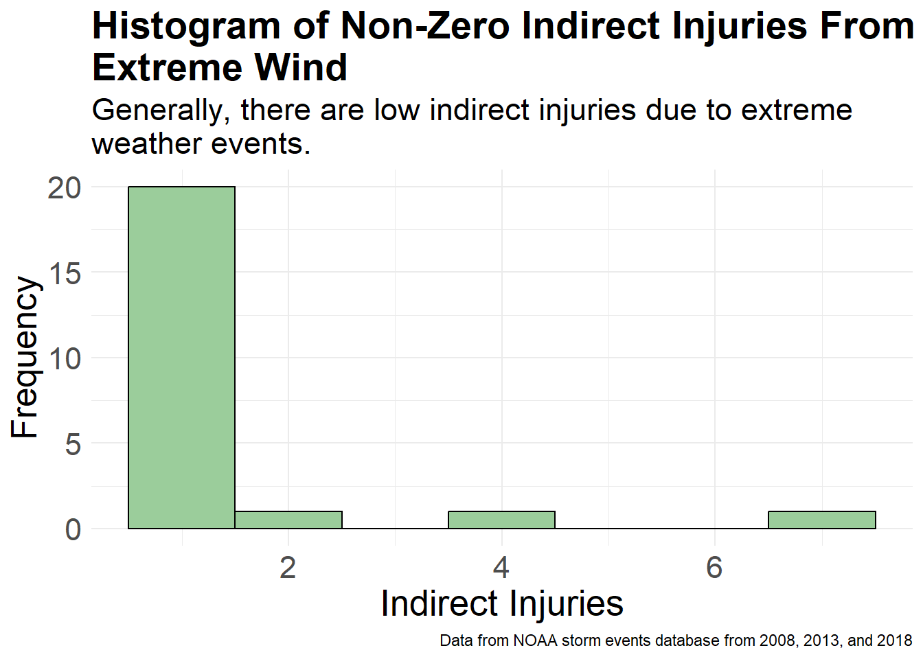
#make category
data$INJURIES_DIRECT_cat <- ifelse(data$INJURIES_DIRECT == 0, "Zero", "Non-Zero")

ggplot(data, aes(x = INJURIES_DIRECT_cat)) +
  geom_bar(fill = "brown2", color = "black") +
  labs(title = "Counts of Non-Zero vs. Zero Direct Injuries", caption = "Data from NOAA storm events database from 2008, 2013, and 2018",
  subtitle = "Most extreme weather events have zero direct injuries.",
    y = "Count") +
  theme_minimal() +
  theme(plot.title = element_text(size = 21, face = "bold"),
    plot.subtitle = element_text(size = 17),
    axis.title.x = element_blank(),
    axis.title.y = element_text(size = 19),
    axis.text.x = element_text(size = 17),
    axis.text.y = element_text(size = 17))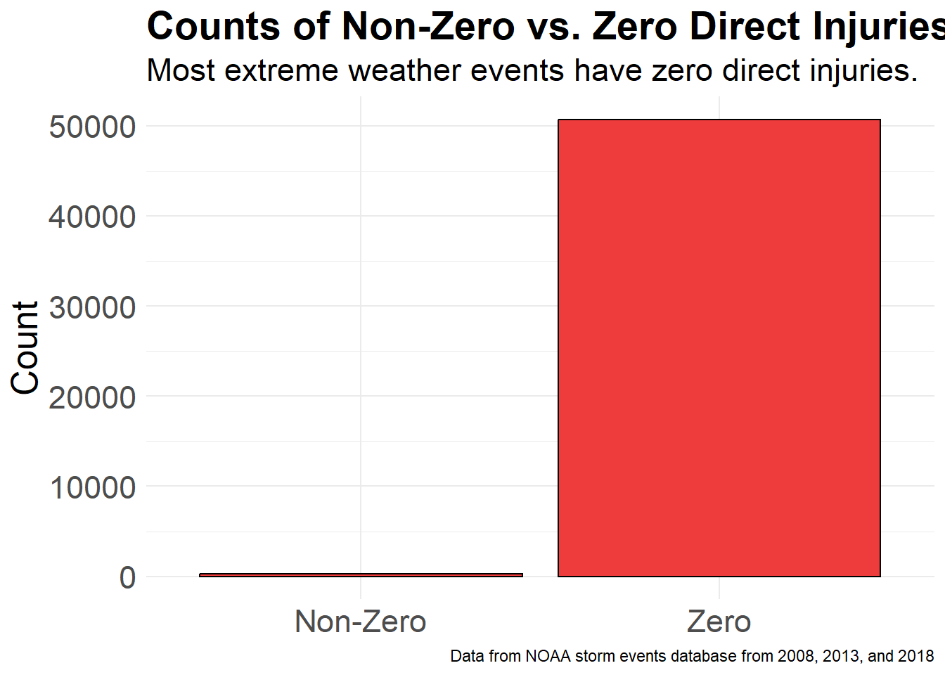
#remove zeros
non_zero_INJURIES_DIRECT <- data[data$INJURIES_DIRECT > 0, ]

ggplot(non_zero_INJURIES_DIRECT, aes(x = INJURIES_DIRECT)) +
  geom_histogram(binwidth = 1, fill = "brown4", color = "black") +
  labs(title = "Histogram of Non-Zero Direct Injuries From\nExtreme Wind", caption = "Data from NOAA storm events database from 2008, 2013, and 2018",
  subtitle = "Generally, there are low direct injuries due to extreme\nweather events.",
    x = "Direct Injuries",
    y = "Frequency") +
  theme_minimal() +
  theme(plot.title = element_text(size = 21, face = "bold"),
    plot.subtitle = element_text(size = 17),
    axis.title.x = element_text(size = 20),
    axis.title.y = element_text(size = 19),
    axis.text.x = element_text(size = 17),
    axis.text.y = element_text(size = 17))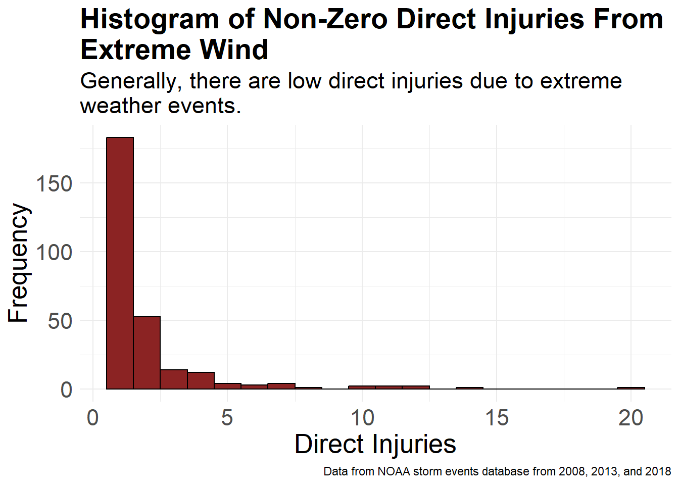
#make category
data$DEATHS_INDIRECT_cat <- ifelse(data$DEATHS_INDIRECT == 0, "Zero", "Non-Zero")

ggplot(data, aes(x = DEATHS_INDIRECT_cat)) +
  geom_bar(fill = "cornsilk1", color = "black") +
  labs(title = "Counts of Non-Zero vs. Zero Indirect\nDeaths", caption = "Data from NOAA storm events database from 2008, 2013, and 2018",
  subtitle = "Most extreme weather events have zero indirect deaths.",
    y = "Count") +
  theme_minimal() +
  theme(plot.title = element_text(size = 21, face = "bold"),
    plot.subtitle = element_text(size = 17),
    axis.title.x = element_blank(),
    axis.title.y = element_text(size = 19),
    axis.text.x = element_text(size = 17),
    axis.text.y = element_text(size = 17))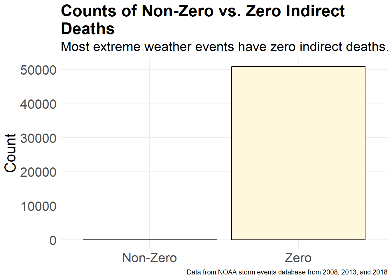
#remove zeros
non_zero_DEATHS_INDIRECT <- data[data$DEATHS_INDIRECT > 0, ]

ggplot(non_zero_DEATHS_INDIRECT, aes(x = DEATHS_INDIRECT)) +
  geom_histogram(binwidth = 1, fill = "cornsilk3", color = "black") +
  labs(title = "Histogram of Non-Zero Indirect Deaths From\nExtreme Wind", caption = "Data from NOAA storm events database from 2008, 2013, and 2018",
  subtitle = "Generally, there are low indirect deaths due to extreme\nweather events.",
    x = "Indirect Deaths",
    y = "Frequency") +
  theme_minimal() +
  theme(plot.title = element_text(size = 21, face = "bold"),
    plot.subtitle = element_text(size = 17),
    axis.title.x = element_text(size = 20),
    axis.title.y = element_text(size = 19),
    axis.text.x = element_text(size = 17),
    axis.text.y = element_text(size = 17))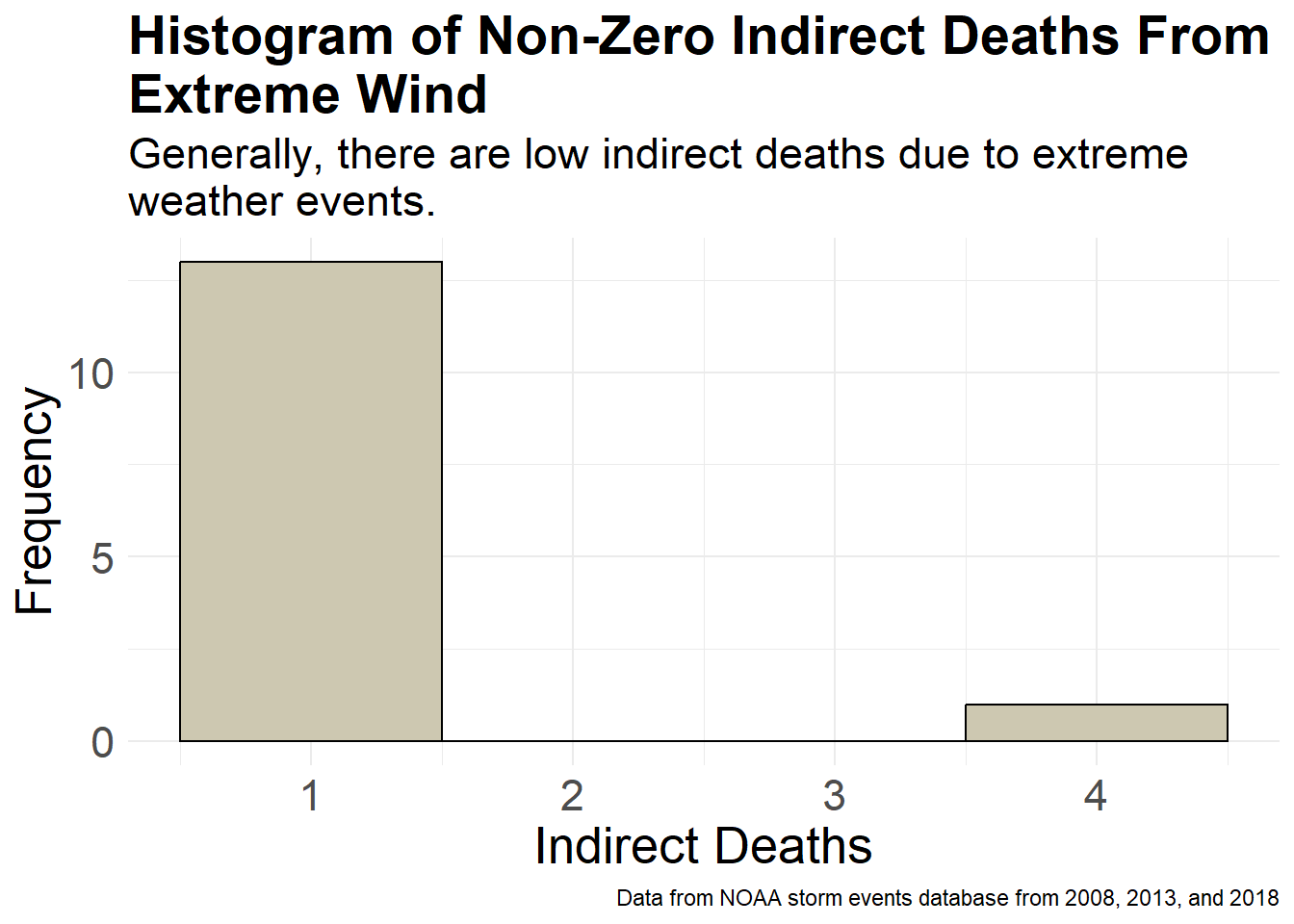
#make category
data$DEATHS_DIRECT_cat <- ifelse(data$DEATHS_DIRECT == 0, "Zero", "Non-Zero")

ggplot(data, aes(x = DEATHS_DIRECT_cat)) +
  geom_bar(fill = "darkolivegreen3", color = "black") +
  labs(title = "Counts of Non-Zero vs. Zero Direct Deaths", caption = "Data from NOAA storm events database from 2008, 2013, and 2018",
  subtitle = "Most extreme weather events have zero direct deaths.",
    y = "Count") +
  theme_minimal() +
  theme(plot.title = element_text(size = 21, face = "bold"),
    plot.subtitle = element_text(size = 17),
    axis.title.x = element_blank(),
    axis.title.y = element_text(size = 19),
    axis.text.x = element_text(size = 17),
    axis.text.y = element_text(size = 17))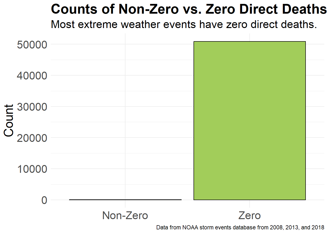
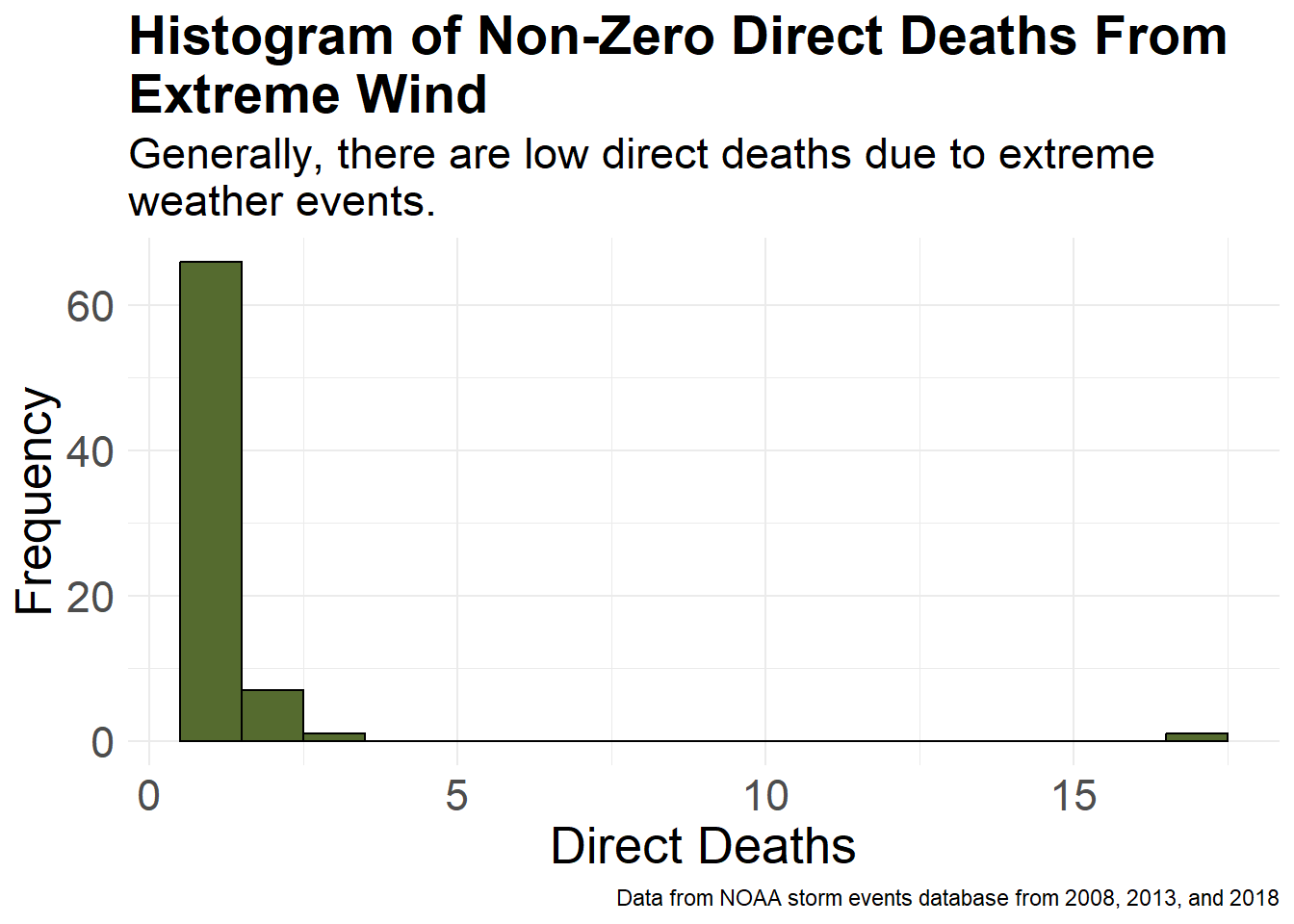
#remove zeros
non_zero_DEATHS_DIRECT <- data[data$DEATHS_DIRECT > 0, ]

ggplot(non_zero_DEATHS_DIRECT, aes(x = DEATHS_DIRECT)) +
  geom_histogram(binwidth = 1, fill = "darkolivegreen", color = "black") +
  labs(title = "Histogram of Non-Zero Direct Deaths From\nExtreme Wind", caption = "Data from NOAA storm events database from 2008, 2013, and 2018",
  subtitle = "Generally, there are low direct deaths due to extreme\nweather events.",
    x = "Direct Deaths",
    y = "Frequency") +
  theme_minimal() +
  theme(plot.title = element_text(size = 21, face = "bold"),
    plot.subtitle = element_text(size = 17),
    axis.title.x = element_text(size = 20),
    axis.title.y = element_text(size = 19),
    axis.text.x = element_text(size = 17),
    axis.text.y = element_text(size = 17))